SPINACH
Helping Spinach streamline their checkout process.

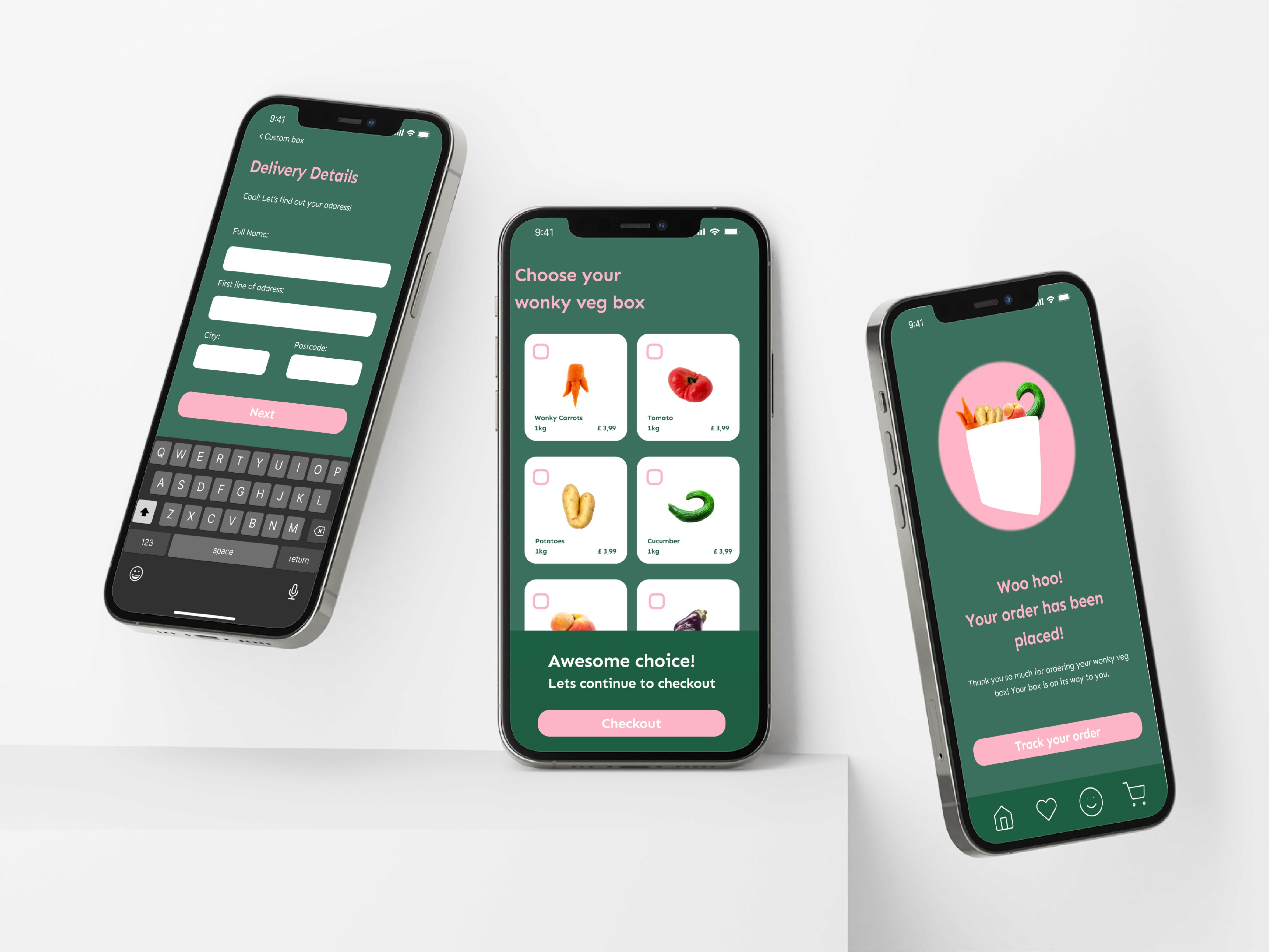
During Memorisely's UX/UI bootcamp, I worked on improving the checkout process of the Spinach app. Over a period of two weeks, I converted lo-fidelity wireframes into hi-fidelity prototypes of the checkout process.
WorkFlow
Convert lo-fidelity
wireframes into a hi-fidelity
prototype
Tools
Timeline
2023, 2 weeks
Team
Me and Callum
Project Overview:
The product:
Spinach is a vegetable box that fights food waste. They rescue odd and surplus fruits and vegetables straight from farms, delivering them to their customers' doorstep.
The goal:
The goal was to increase customer satisfaction by streamlining the checkout process for vegetable deliveries, creating a seamless and efficient experience.
How might we help users to checkout more efficiently using Spinach's app?
Prototyping
The goal was to convert the lo-fidelity wireframes into a hi-fidelity prototype. For this, I first defined a 4-column grid that follows the 4-pixel rule. I specified primary, secondary and neutral colors and defined them in different shades. As a font I chose “Sen” in bold and regular, because it looks clean and clear and the visuals should support a simple, straightforward ordering process. I then created the various components and used them to create the hi-fidelity prototype.


