APHRODITE
Creative support with branding and website.

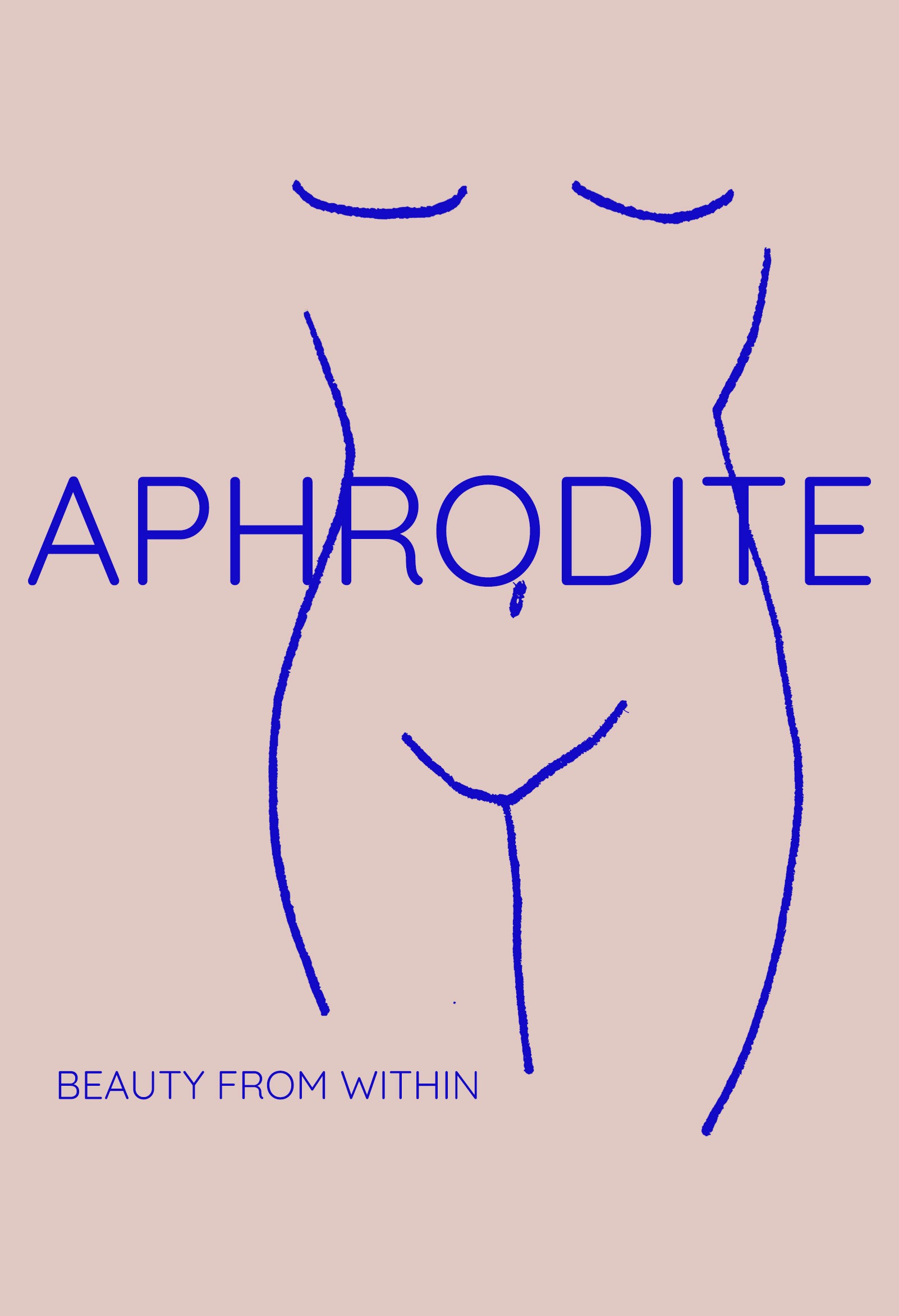
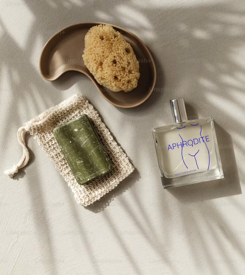
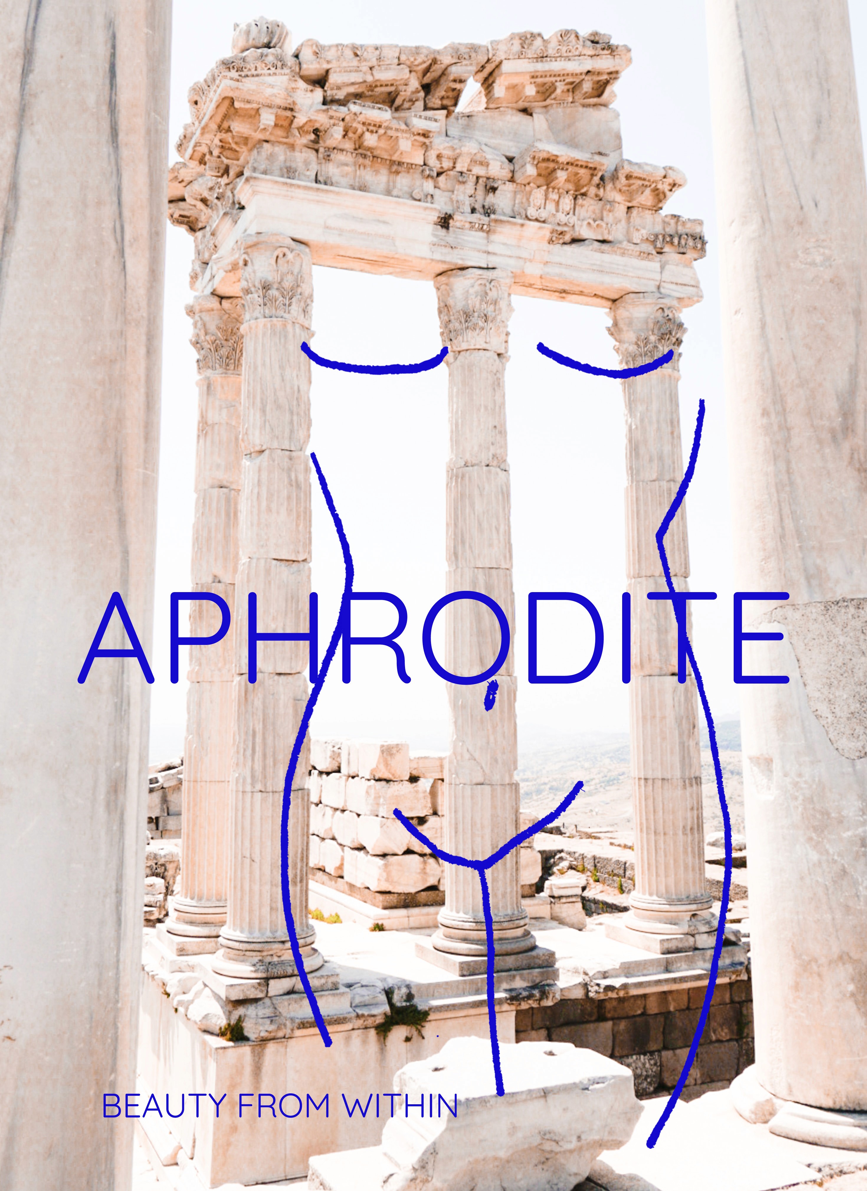
The team at Aphrodite approached me to design their cosmetic packaging. They wanted a link to a goddess with a modern twist. The branding and messaging to be body-positive and beauty-positive with the slogan beauty from within. Additionally, they wanted to visualise what the website mockup would look like for mobile and how the branding would work on different products.
WorkFlow
Client Meeting
Research
Ideation
Designing
Delivering
Tools
Design Process
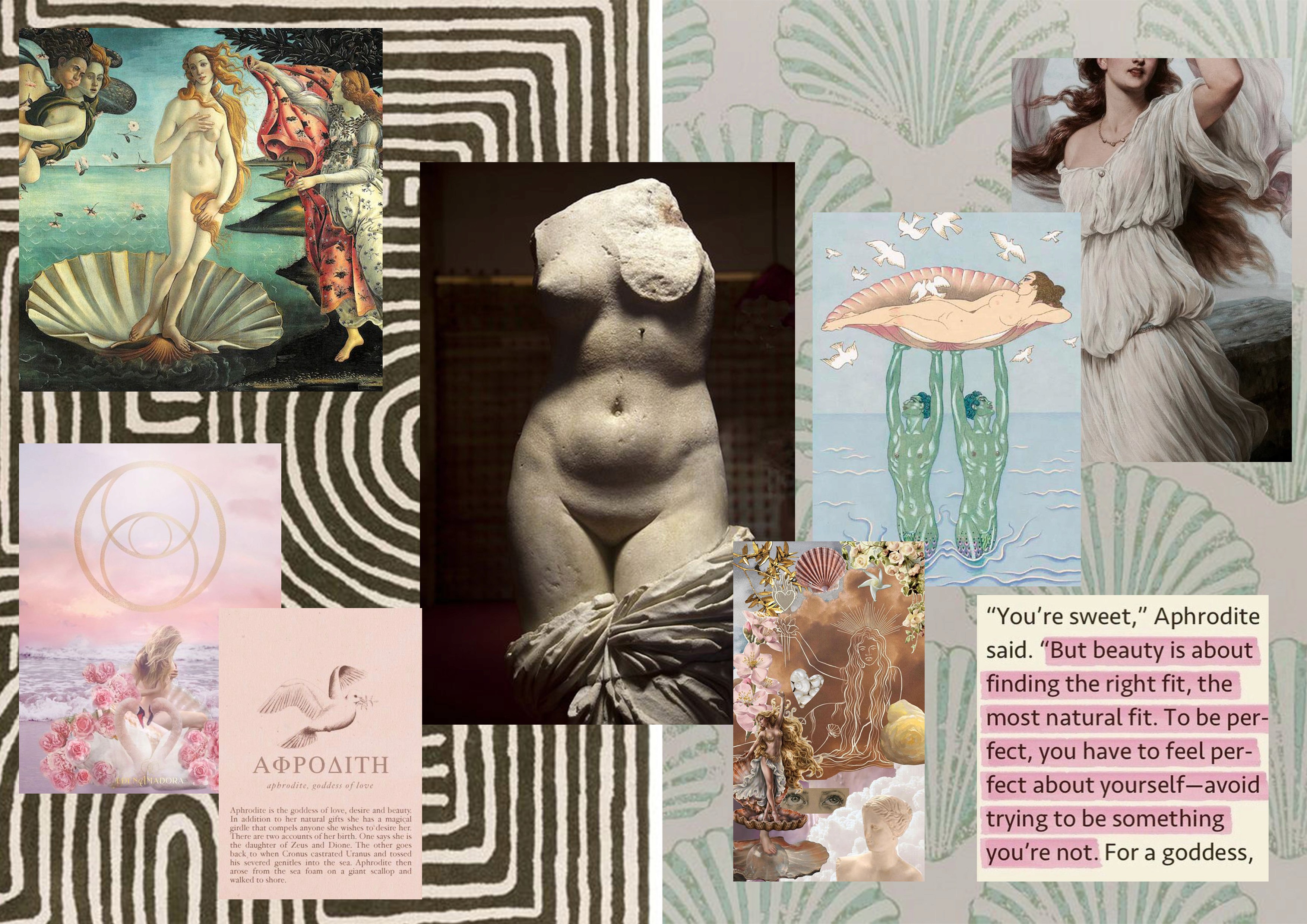
The objective was to align with Aphrodite's brief by establishing a connection to the desired message: 'Beauty is within.' Keeping this body-positive message at the forefront, I delved into researching images that exalted the female form. During my exploration, the Greek goddess Aphrodite emerged as a powerful symbol of beauty, love, and natural femininity.
Drawing inspiration from this research, I embarked on sketching female figures in a streamlined, line-based style. Recognizing Aphrodite's preference for a strong, clean, and minimalistic branding, I honed in on key colors such as pink, blue, and white. Subsequently, I translated these elements into the design of both their product and website, ensuring a cohesive and visually impactful representation aligned with the essence of Aphrodite's vision.
